 listicle
Best Interior Paint Color Trends for 2026
Table of Contents
- 2026 Paint Color Trends: The Year's Defining Palette
- Benjamin Moore's Silhouette: The Official Color of the Year
- Warm Neutral Paint Colors Dominating 2026
- Cool Neutrals and Muted Greens for Modern Interiors
- 2026 Paint Colors for Living Rooms: Room-by-Room Application
- How to Choose Interior Paint Colors: Testing and Undertones
- Bold Statement Colors and Rich Saturated Hues
- Layering Colors and Coordinated Palettes for Cohesion
- Frequently Asked Questions
Last Updated: October 5, 2026
2026 Paint Color Trends: The Year's Defining Palette
Interior paint color trends for 2026 are moving toward a refined balance of sophistication and warmth. The palette emphasizes nature-inspired hues, muted earth tones, and carefully curated neutrals that work across multiple rooms without feeling disconnected. The shift is clear: bold statements exist, but they're paired with restraint and intentional layering.
This year's best interior paint color trends reflect a broader design philosophy. Rather than dramatic swings between seasons, 2026 brings cohesion. Warm neutrals anchor living spaces. Cool greens provide modern sophistication. Soft whites and off-whites create breathing room.
Benjamin Moore's Silhouette: The Official Color of the Year
Benjamin Moore announced Silhouette (AF-655) as the 2026 Color of the Year, and the choice signals where interior design is heading. This deep, sophisticated tone sits between charcoal and navy, offering elegance without coldness.
What makes Silhouette significant isn't just its depth, it's the permission it gives homeowners to go darker. For years, design trends pushed lighter, airier palettes. Silhouette reverses that, suggesting that richness and depth create visual interest and grounding in modern interiors.
The HGTV Home by Sherwin-Williams 2026 Color Collection complements this direction with eight coordinated shades including Neutral Ground, Cordovan, and Still Water.
Warm Neutral Paint Colors Dominating 2026
Warm neutrals remain the foundation of 2026 interior paint color trends. These aren't the cool beiges of previous years. Today's warm neutrals carry undertones of ochre, terracotta, and soft tan that feel grounded and inviting.
The strength of warm neutrals is their flexibility. They adapt to different lighting conditions, work with both traditional and modern furnishings, and create a sense of continuity when applied across multiple rooms. A warm neutral in a north-facing room with limited sunlight still reads as intentional rather than dull.
Earthy Tones and Nature-Inspired Shades
Earth tones draw directly from landscape inspiration: clay, stone, sand, and weathered wood. These colors feel authentic because they reference the natural world. Reddened Earth, Universal Khaki, and similar shades from current trend palettes represent this category.
When selecting an earthy tone, consider the room's purpose. Warmer earth tones work well in spaces where you gather: kitchens, dining areas, and family rooms. They encourage comfort and conversation. In bedrooms, slightly cooler earth tones, those with gray undertones rather than red, create calm without coldness.
Soft Whites and Off-Whites for Timeless Appeal
Soft whites and off-whites serve a critical function in 2026 interiors: they provide visual rest. Not every wall needs color. Strategic use of soft whites, particularly in trim, ceilings, or accent areas, creates breathing room and prevents color fatigue.
Off-whites work especially well in spaces where you want neutral backdrop but not the coldness of bright white. They pair beautifully with warm neutrals in adjacent rooms, creating flow without monotony. Many homeowners use soft whites in bedrooms and bathrooms where calm is the priority, then introduce warmer or cooler tones in living areas.
Cool Neutrals and Muted Greens for Modern Interiors
Cool neutrals bring contemporary sophistication to 2026 interior paint color trends. These grays and cool beiges work in spaces where you want modern aesthetic without the starkness of true gray. Cool neutrals pair well with stainless steel, glass, and minimalist furnishings.
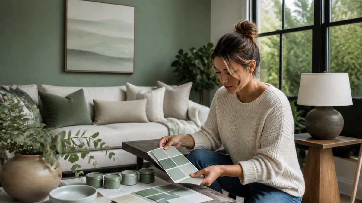
Muted greens represent one of the strongest trends in 2026. Unlike the saturated greens of previous years, today's greens are subdued, sophisticated, and nature-derived. They reference sage, eucalyptus, and botanical inspiration without shouting. These colors work in living rooms, home offices, and even kitchens where you want calm focus.
Sage, Eucalyptus, and Smoky Jade Shades
Sage green carries warm undertones and pairs naturally with warm neutrals. It's approachable, not too bold, not too subtle.
The key to using these greens successfully is understanding your room's lighting. North-facing rooms benefit from sage (which carries warmth). South-facing rooms can handle eucalyptus or smoky jade without feeling cold.
2026 Paint Colors for Living Rooms: Room-by-Room Application
Living rooms demand careful color selection because these spaces serve multiple purposes and receive varied lighting throughout the day. A color that works at noon might feel different at dusk. The best approach combines a main wall color with strategic accent application.
For 2026, many living rooms are using warm neutrals as the base (three walls) with either Silhouette, a muted green, or a soft white accent wall. This creates visual interest without overwhelming the space. The accent wall becomes a focal point, typically the wall opposite the entry or behind seating, while surrounding walls maintain cohesion.
Living Room Focal Points and Accent Walls
An accent wall works when it anchors the room's focus. In living rooms, this is usually the wall behind a sofa or entertainment area. A rich color here draws the eye and creates intentional depth. Silhouette, Cordovan, or even a deeper muted green works well for this purpose.
The supporting walls should complement without competing. A warm neutral three walls with a rich accent creates balance. The trim, typically soft white or off-white, frames the composition and prevents the accent from feeling isolated. This layering approach is what separates intentional design from random color application.
Bedrooms and Bathrooms with Soft, Layered Tones
Bedrooms benefit from softer, more restful palettes. Soft whites, pale warm neutrals, or muted greens create calm without stimulation.
Bathrooms follow similar logic but can handle slightly bolder accents because of their smaller scale. A bathroom with soft white walls and a muted green or eucalyptus accent creates spa-like calm.
How to Choose Interior Paint Colors: Testing and Undertones
Choosing interior paint colors requires more than preference, it demands testing and understanding how light affects color perception. This is where many DIY projects fail. A color that looks perfect in the store can feel completely different on your walls because of undertones, lighting, and surrounding surfaces.
Always Pro Painters recommends obtaining paint samples and testing them on your actual walls. Not on poster board. Not in the store. On the wall where the color will live, in the lighting conditions you experience daily.
Understanding Lighting, Orientation, and Undertone Impact
Undertones are the hidden colors that influence how a paint appears. A warm neutral might carry red, orange, or yellow undertones. A cool neutral carries blue or gray undertones.
Orientation matters significantly. East-facing walls receive warm morning light that brings out warm undertones. West-facing walls get intense afternoon heat that can intensify warm colors. North-facing walls stay relatively consistent but tend toward cool.
Lighting type also influences perception. Incandescent bulbs warm colors. LED and fluorescent lights cool them. If you're testing colors under incandescent but your home uses LED, the final result will differ.
Paint Color Samples for Walls: Before You Commit
Obtaining paint color samples for walls is the single most important step before committing to a full room. Most paint retailers offer sample sizes, typically quarts or smaller, specifically for this purpose. Apply samples to different walls in the room, not just one location.
Watch how samples perform across different times of day. Morning light, afternoon light, and evening light will all reveal different aspects of the color. A color that looks warm at noon might feel cold at dusk. After three days of observation, you'll have reliable information about how that color will actually perform in your space.
Bold Statement Colors and Rich Saturated Hues
While 2026 emphasizes restraint and sophistication, bold statement colors still have a place, used strategically.
Statement colors work best in rooms where you spend limited time or where the color serves a specific purpose. A home office with one wall in a deep, saturated color creates focus. A powder room in an unexpected shade becomes memorable.
The key is intentionality. A bold color should feel chosen, not accidental. It pairs with complementary neutrals and works within the room's lighting conditions. Silhouette as a full-room color in a well-lit space creates drama.
Layering Colors and Coordinated Palettes for Cohesion
Layering colors across rooms creates visual flow and prevents each space from feeling isolated. This is where coordinated palettes, like the HGTV Home by Sherwin-Williams collection, become valuable. These palettes are tested combinations that work together across multiple rooms.
Layering doesn't mean using the same color everywhere. It means using colors that share undertones or complementary characteristics. A warm neutral in a living room pairs naturally with a softer warm tone in an adjacent hallway. A muted green in one bedroom complements a soft white in another. The relationship between colors creates cohesion.
Trim Pairings and Finish Recommendations
Trim color is often overlooked but dramatically influences how wall colors perform. Soft white or off-white trim frames colors and prevents them from feeling chaotic.
Paint finish also matters. Matte or eggshell finishes on walls create a sophisticated, contemporary look that's currently preferred. Semi-gloss or gloss finishes on trim provide contrast and durability. Quality finishes determine longevity and how colors actually appear under light.
| Finish Type | Best For | Visual Effect | Durability |
|---|---|---|---|
| Matte | Walls, low-traffic areas | Sophisticated, modern | Moderate |
| Eggshell | Walls, moderate traffic | Subtle sheen, forgiving | Good |
| Satin | Bathrooms, kitchens | Soft sheen, wipeable | Very good |
| Semi-gloss | Trim, doors, high-traffic | Reflective, durable | Excellent |
Choosing interior paint color trends for 2026 means balancing sophistication with warmth, testing before committing, and understanding how light affects color perception.
Frequently Asked Questions
What are the best interior paint colors trending in 2026?
The best interior paint color trends for 2026 center on Benjamin Moore's Silhouette as the official Color of the Year, paired with warm neutrals, soft whites, muted greens like sage and eucalyptus, and earthy earth tones. The HGTV Home by Sherwin-Williams 2026 collection includes Neutral Ground, Cordovan, Still Water, and Reddened Earth. These colors work across living spaces because they balance sophistication with versatility, allowing homeowners to layer colors and create cohesive palettes room-to-room.
How do I choose interior paint colors that work for my specific room?
Start by considering lighting and orientation: north-facing rooms benefit from warm neutrals to add warmth, while south-facing spaces can handle cool neutrals and muted greens. Test paint color samples for walls in your actual space by painting large swatches and observing them at different times of day. Check undertones carefully, warm neutrals have yellow or red bases, while cool neutrals lean gray or blue. Professional painters recommend viewing samples under your room's natural and artificial lighting before committing to a full paint job.
Are warm or cool neutral paint colors more popular in 2026?
Both are trending, but warm neutrals hold a slight edge in 2026 for creating inviting, comfortable interiors. Warm neutral paint colors like Reddened Earth and Universal Khaki appeal to homeowners seeking natural feel and softness. Cool neutrals and muted greens (sage, eucalyptus, smoky jade) are gaining ground for modern, sophisticated spaces. The trend leans toward layering both, using warm neutrals as base colors and cool greens as accent walls or statement areas for visual depth.
Should I test paint colors before committing to a full interior refresh?
Yes, testing paint colors before committing is essential. Paint a large swatch (at least 2 feet by 2 feet) of your chosen color on the wall and observe it for several days under natural daylight and artificial lighting. Colors shift dramatically depending on time of day and light source. Digital tools like Facade Colorizer let you preview 2026 color trends on your walls virtually, reducing risk. This step is often recommended to avoid costly repaints and ensure the final result matches your vision.