
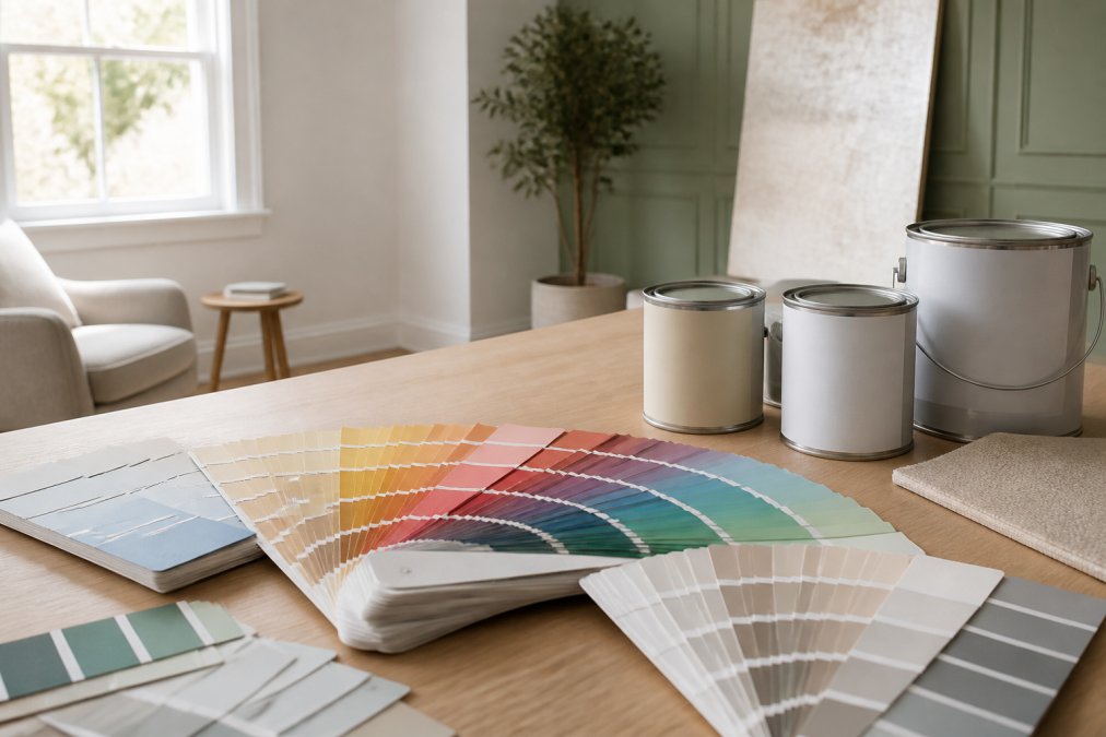
 ultimate-guide
How to Choose Interior Paint Colors: A 2026 Guide
Table of Contents
- Start with Room Size, Natural Light, and Color Psychology
- How to Match Paint Colors with Existing Furniture
- Creating a Cohesive Color Palette Across Your Home
- How to Test Paint Samples on Walls Before Committing
- Best Interior Paint Finishes for Different Rooms
- Choosing Interior Paint Colors for Resale vs. Personal Style
- Sustainable and Non-Toxic Paint: What to Look For
- DIY vs. Professional Painting: Budgeting and What You Get
Last Updated: August 21, 2026
Choosing the wrong paint color is one of the most expensive mistakes a homeowner can make, not because paint itself is costly, but because living with a color that looked perfect on the chip and reads completely wrong on the wall is a slow-burn regret. This guide covers everything from lighting science to finish selection, so you get it right the first time.
The core problem most guides don't address: color selection isn't just aesthetic. It's technical. Light, surface texture, room proportions, and adjacent spaces all change how a color reads.
Start with Room Size, Natural Light, and Color Psychology
Room dimensions and light exposure are the foundation of any successful color decision. A color that works beautifully in a south-facing room with abundant natural light can look flat and oppressive in a north-facing space that never gets direct sun.
Smaller rooms generally benefit from lighter hues and lower saturation, which push walls back visually and create a sense of openness. Larger rooms can handle deeper, richer tones without feeling closed in.
How Lighting Temperature (Kelvin) Shifts Your Color Palette
Lighting temperature is measured in Kelvin (K), and it has a direct impact on how interior paint colors read in a finished space. According to the U.S. Department of Energy's lighting guidance, warm light sources (2700K-3000K) are typical of incandescent and soft-white LED bulbs, while cool light sources (4000K-5000K) mimic daylight.
Warm light amplifies yellows, reds, and oranges while muting blues and greens. Cool light does the opposite. A greige that reads as warm and inviting under a 2700K bulb can shift toward a cold, slightly purple tone under 4000K office-style lighting. Test your samples under the actual lighting conditions of the room, not just in daylight.
Color Psychology Room by Room
Color psychology is a practical tool for interior paint selection.
- Bedrooms: Muted blues, soft greens, and warm lavenders are associated with calm and rest.
- Kitchens: Warm whites, soft yellows, and earthy neutrals encourage appetite and conversation.
- Home offices: Medium-value blues and greens support focus. Avoid reds, which can increase stress perception.
- Living rooms: Versatile neutrals with warm undertones anchor furniture and allow flexibility.
- Bathrooms: Crisp whites and cool aquas work well, but consider vanity lighting first.
How to Match Paint Colors with Existing Furniture
The biggest mistake is starting with the paint chip instead of the room. Your furniture, flooring, and fixed elements are already in place. The paint color serves them.
Pull the dominant colors from your largest pieces first: sofa, rug, cabinetry, or hardwood floor. These are your anchors. From there, you're either complementing those tones or contrasting them intentionally.
Using an Inspiration Piece to Build Your Color Scheme
An inspiration piece is a single item in the room that contains multiple colors you love together. It could be a rug, art, throw pillow, or fabric swatch. The colors in that piece have already been curated to work together.
Pull three to five colors from your inspiration piece. The most dominant becomes your wall color candidate. The secondary tones inform trim, accent walls, or soft furnishings. This method is more reliable than building a palette from scratch.
Understanding Undertones and the Color Wheel
Undertones are the subtle secondary hues beneath a paint color's surface appearance. A white wall can read pink, yellow, or green depending on its undertones and the light hitting it. This is the single most misunderstood concept in paint selection.
Every color on the color wheel carries an undertone. Beiges can lean orange, red, or green. Grays can pull blue, purple, or green. Compare your chip against a pure white in the same lighting conditions. The undertone will reveal itself immediately.
Complementary colors sit opposite each other on the color wheel and create visual tension, which works well for accent walls. Monochromatic schemes use variations in hue, saturation, and value within a single color family, producing a quieter, more layered look.
Creating a Cohesive Color Palette Across Your Home
Open floor plans and connected spaces demand more planning than single-room decisions. The goal is room flow: the visual experience of moving from one space to another without jarring transitions.
A common approach is to choose a unifying neutral for hallways and transitional spaces, then allow individual rooms to have more personality.
Color Hierarchy: Dominant, Secondary, and Accent Tones
Color hierarchy is a structured approach to distributing color across a space. The 60-30-10 rule is a widely used framework:
| Color Role | Share of Space | Typical Application |
|---|---|---|
| Dominant | 60% | Walls, large furniture |
| Secondary | 30% | Upholstery, rugs, curtains |
| Accent | 10% | Pillows, art, trim details |
The dominant tone sets the room's mood. The secondary tone adds depth. The accent tone is where personality enters and is easiest to change if your taste evolves.
Color Trends vs. Timeless Neutrals: Which to Choose
Trendy colors are seductive in design media and miserable to live with in three years. Timeless neutrals age gracefully and adapt to changing decor.
If you're staying in the home for a decade or more, invest in neutrals with character: warm whites, complex greiges, soft sage greens. If you're refreshing for resale within 18 months, a carefully selected on-trend color in a low-risk space can generate buyer interest. The National Association of Realtors' home staging guidance consistently points to neutral, broadly appealing palettes as the safest choice for maximizing buyer interest.
How to Test Paint Samples on Walls Before Committing
Testing paint samples directly on the wall is non-negotiable. Paint chips, digital visualizer tools, and physical swatches are useful starting points, but none replicate how a color reads at scale, in your specific light, against your specific surfaces.
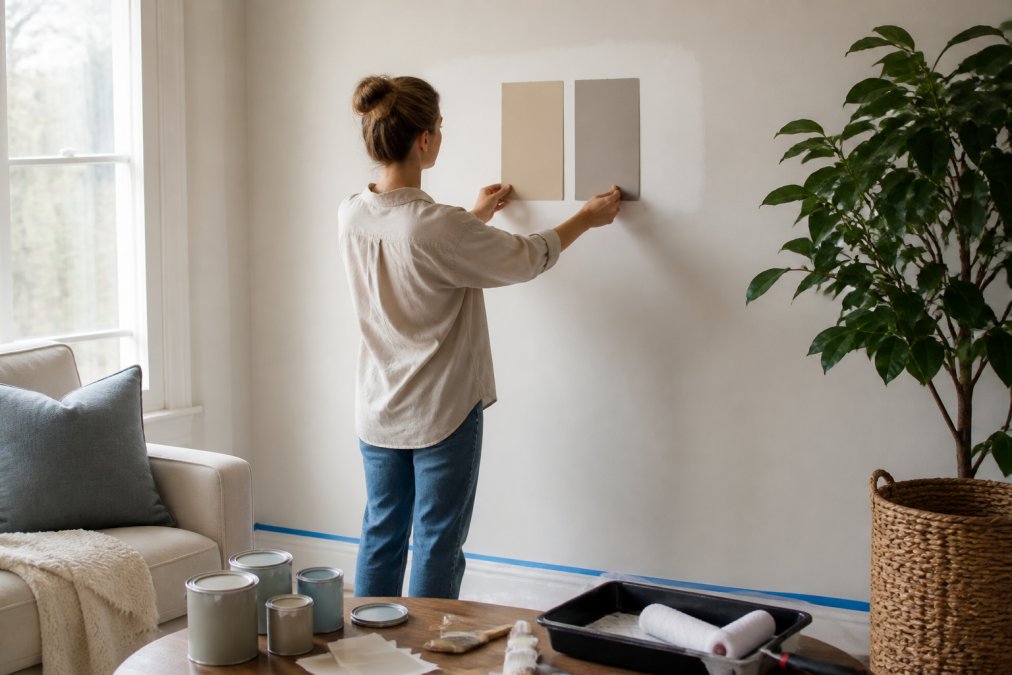
Purchase sample pots and paint a minimum 12-by-12-inch patch directly on the wall. Paint two coats for accurate coverage. Test in at least two locations: one near a window and one on an interior wall away from natural light. Leave the patches up for at least 48 hours and observe them across different times of day and under your artificial lighting at night.
Watch for undertone shifts, value changes, and how the sample looks next to your trim, flooring, and furniture. Digital visualizer tools are useful for rough planning, but don't rely on them for final decisions. Screen calibration and photography variables introduce too much inaccuracy.
Best Interior Paint Finishes for Different Rooms
Choosing the right finish is as important as choosing the right color. The sheen level affects both the appearance of the color and the wall's durability.
Matte and Eggshell: Low-Sheen Rooms
Matte finish has no reflective quality, hides surface imperfections well, and produces a flat, sophisticated look. It's ideal for bedrooms, dining rooms, and ceilings. The trade-off is washability: matte finishes are harder to clean without leaving marks.
Eggshell finish adds a very slight sheen and is more washable than matte while still reading as low-key and refined. Eggshell is the most versatile finish for living rooms, adult bedrooms, and formal spaces where light cleaning is occasionally needed.
Satin and Semi-Gloss: High-Traffic and Moisture-Prone Areas
Satin finish has a soft, pearl-like sheen that holds up well to scrubbing and moisture. It's the go-to choice for hallways, children's rooms, and family spaces that see daily wear.
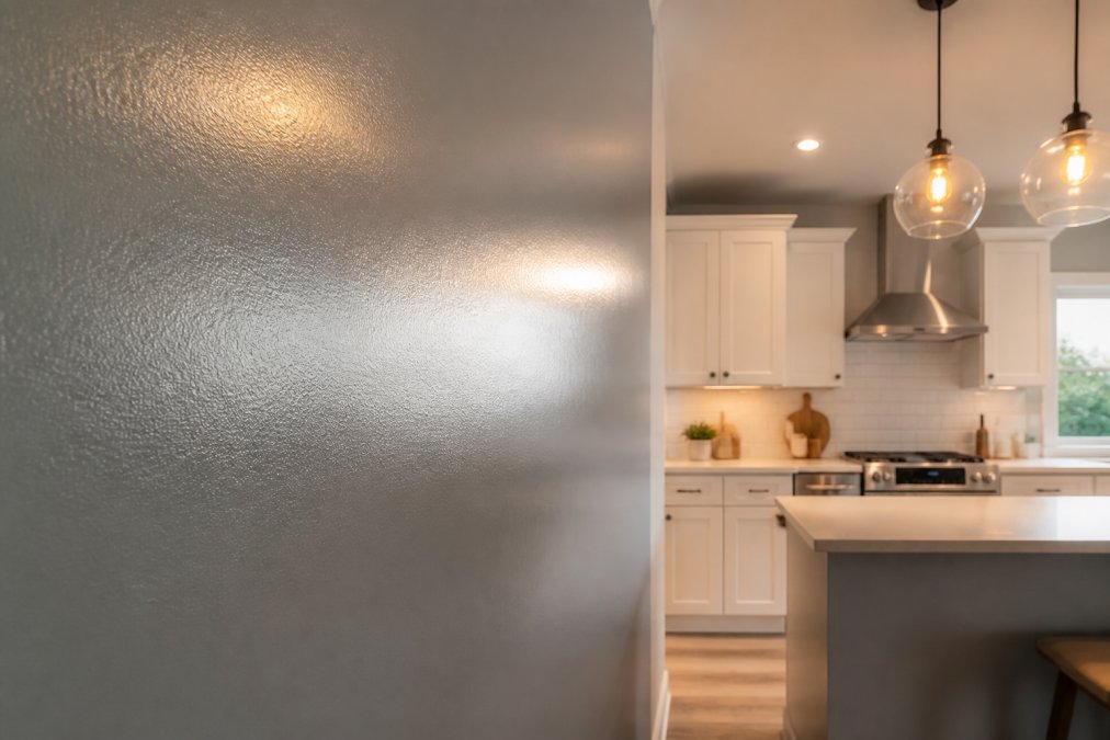
Semi-gloss is noticeably reflective and highly durable. It's best suited for kitchens, bathrooms, trim work, and cabinetry. The higher sheen amplifies light and makes surfaces easier to wipe clean, but it also highlights wall imperfections. According to the Environmental Protection Agency's indoor air quality guidelines, proper ventilation during and after painting is important regardless of finish type.
Choosing Interior Paint Colors for Resale vs. Personal Style
Resale-focused color selection and personal style are not always in conflict, but they require different priorities. For resale, the goal is broad appeal: colors that don't exclude buyers, photograph well, and make spaces feel clean and move-in ready.
Warm whites, soft greiges, and light gray-blues consistently perform well in resale contexts. Bold accent walls and highly saturated colors can trigger hesitation in buyers who don't share your taste.
For personal style, a color you'll love for years is worth the investment, even if unconventional. Make bold choices in spaces that are easy to repaint (bedrooms, powder rooms) and keep shared and transitional spaces more neutral.
Sustainable and Non-Toxic Paint: What to Look For
Paint formulation has improved substantially. Low-VOC and zero-VOC options are now widely available from most major manufacturers.
VOC stands for volatile organic compounds, the chemicals in paint that off-gas during and after application. High-VOC paints contribute to indoor air quality problems and are associated with headaches and respiratory irritation. The EPA's guidance on VOCs and indoor air quality outlines why minimizing VOC exposure in enclosed spaces matters, particularly in homes with children or anyone with respiratory sensitivities.
What to look for on the label:
- Zero-VOC: Less than 5 grams per liter of VOCs in the base.
- Low-VOC: Under 50 g/L for flat finishes, under 150 g/L for non-flat finishes, per EPA standards.
- Third-party certifications: Look for GREENGUARD Gold certification.
For most homeowners, a certified low- or zero-VOC latex paint from a reputable manufacturer is the practical sweet spot between health, performance, and availability.
DIY vs. Professional Painting: Budgeting and What You Get
DIY painting costs less upfront and more in time, materials, and often, rework. Professional painting costs more upfront and delivers a predictably better result.
| Factor | DIY | Professional |
|---|---|---|
| Surface prep | Often skipped or minimal | Detailed: patching, sanding, priming |
| Time investment | High (weekends, disruption) | Compressed (days, not weeks) |
| Material quality | Varies by buyer knowledge | Specified by experience |
| Clean lines | Difficult without training | Consistent with proper masking |
| Finish quality | Depends on skill level | Professional-grade results |
| Rework risk | High if prep is skipped | Low with final walkthrough |
DIY makes sense for small, low-stakes spaces: a single accent wall, a bathroom, or a room with simple geometry. For full interior refreshes, rooms with detailed trim, or properties being prepared for sale, professional painting typically delivers better value when you factor in time and the cost of fixing mistakes.
Always Pro Painters approaches every project with detailed surface preparation, clean lines, and a final walkthrough to confirm every detail meets expectations. For homeowners weighing the decision, the real question is whether the time, learning curve, and risk of a result you're not happy with is worth the savings. For high-visibility spaces, it rarely is.
Choosing interior paint colors is a process that rewards patience and punishes shortcuts. The homeowners who end up repainting are almost always the ones who skipped the sample testing, ignored the undertones, or used the wrong finish for the room's function. Always Pro Painters handles the full process, from color consultation to detailed surface preparation, clean application, and a final walkthrough to make sure the result is exactly what you envisioned. Request a free estimate and let's build a color plan that works the first time.
Frequently Asked Questions
What is the 3 color rule in interior design?
The 3 color rule suggests structuring any room around three colors: a dominant hue (60% of the space, typically walls and large furniture), a secondary color (30%, used on upholstery or curtains), and an accent (10%, applied through pillows, artwork, or trim). This ratio creates visual balance without making a room feel chaotic. You can apply it across a monochromatic palette or with complementary colors from opposite sides of the color wheel.
Should a living room be satin or eggshell?
Eggshell is the better choice for most living rooms. It has a soft, low sheen that hides minor wall imperfections and reflects just enough light to keep the space feeling open without looking shiny. Satin has a noticeably higher sheen and works better in higher-traffic areas like hallways or family rooms where walls need regular wiping. For formal living rooms or spaces with textured walls, eggshell gives a cleaner, more refined result.
How do I test paint colors before committing?
Buy sample pots and apply at least two coats to a 12-by-12-inch section of your actual wall, not a piece of cardboard. Check the sample at different times of day: morning light, midday, and under your artificial lighting in the evening. Lighting temperature (measured in Kelvin) dramatically shifts how a color reads. Warm bulbs (2700K) pull out yellow and red undertones; cool daylight bulbs (5000K and above) push colors toward blue and gray. Never choose a color based on a small chip alone.
What color makes a house look expensive?
Soft, complex neutrals tend to read as elevated: warm whites with creamy undertones, greige (gray-beige blends), and muted sage greens consistently photograph well and appeal to buyers. The finish matters as much as the hue. A flat, chalky matte on smooth, well-prepped walls looks far more polished than a glossy finish on patchy surfaces. Consistent color flow between rooms and crisp, clean trim lines are what most buyers associate with a high-quality interior paint job.
How do I coordinate interior paint colors between rooms?
Establish a color hierarchy before you buy anything. Pick one anchor color for the most visible shared space, then choose colors for adjoining rooms that share at least one undertone with it. A warm greige in the hallway, for example, pairs naturally with a deeper taupe in the dining room and a soft ivory in the kitchen. Avoid sharp hue jumps at doorways. Using the same trim color throughout the home is one of the simplest ways to create room flow and visual cohesion.
What's the most popular interior paint color right now?
Warm, earthy neutrals have dominated interior color trends for several years and remain strong in 2026. Soft terracotta, warm white, and muted sage are widely used in residential repaints. That said, trend colors can date a home quickly. If resale value matters, stick with complex neutrals that photograph well and appeal to broad buyer taste. Use trending hues as accents on a feature wall or in smaller spaces like a powder room, where repainting later is low-cost.
This article was written using GrandRanker