
 how-to
How to Create a Monochromatic Home Color Scheme in 7 Steps
Quick Summary
A monochromatic home color scheme uses one base hue across walls, trim, and accents, varied only in lightness. Choose a base color first, test samples under your own lighting, then build tints, shades and tones for depth. The result feels calm, cohesive and intentional.
- Test paint samples on a board at least 12 inches square, checking morning, afternoon and night light.
- Undertones matter: a cool-toned trim against a warm wall is the most common way the room looks off.
- Aim for roughly 60/30/10 proportions across mid, light and dark values on visible surfaces.
- Add texture and sheen variation, such as matte walls and satin trim, to create depth without a second color.
Table of Contents
- What a Monochromatic Color Scheme Means for Your Home
- Step 1: Choose Your Base Color With a Planning Workflow
- Step 2: Read Paint Color Undertones Before You Buy
- Step 3: Build Your Palette With Tints, Shades, and Tones
- Monochromatic Color Scheme Examples for Real Rooms
- Step 4: Add Texture, Finish Variation, and Natural Materials
- Booking a Walkthrough to Plan Your Monochromatic Room
- Frequently Asked Questions
What a Monochromatic Color Scheme Means for Your Home
Last Updated: October 28, 2026
A monochromatic home color scheme uses one base hue across walls, trim, and accents, varied only in lightness. This approach can make a space feel calm and cohesive. The idea is simple: one color family, many values.
Here's the part most people miss. A monochromatic scheme is not the same as painting everything one flat color. The walls, trim, doors, and ceiling each get a different tint, shade, or tone of the same hue. That variation is what creates depth.
Think of it as three layers:
- Base color: The main hue you choose for walls
- Lighter variation: A tint for trim, ceilings, or lighter wall zones
- Deeper variation: A shade or tone for doors, cabinets, or accent walls
Done right, the room looks intentional. Done wrong, it looks unfinished. The difference almost always comes down to planning.
Step 1: Choose Your Base Color With a Planning Workflow
Start with the room, not the paint chip. For thoughtful color input that helps the space feel intentional before the first surface is prepared, see our color consultation. Note how much natural light it gets, what time of day you use it most, and what furniture stays. A north-facing room reads cooler, while a south-facing room shows warm tones more strongly.
Work through this simple workflow:
- List the rooms you want to unify and their main uses
- Pick two or three candidate hues from the same family
- Note which direction each room faces
- Narrow to one base color for the main walls
Once you have a candidate, test it.
Testing Paint Samples Under Your Lighting
Never choose from a small chip alone. Paint a sample board at least 12 inches square and move it around the room. Check it in morning light, afternoon light, and under your lamps at night. A color that looks soft at noon can turn gray or dull by evening.
Before you buy any paint, it helps to see the planning steps side by side.
| Step | What to do | Time or frequency |
|---|---|---|
| List rooms | Note each room's main use | Before any buying |
| Pick hues | Choose two or three from one family | Initial shortlist |
| Check direction | Note which way each room faces | Before narrowing |
| Narrow base | Settle on one base color for walls | Final choice |
| Test samples | Paint a board at least 12 inches square | Check at morning, afternoon and night |
Step 2: Read Paint Color Undertones Before You Buy
Undertones decide whether a monochromatic scheme feels harmonious or clashing. Every color has a hidden warm or cool tone underneath. A "gray" with a blue undertone will fight a "beige" with a yellow undertone, even if both look neutral.
Check undertones this way:
- Hold the sample next to a plain white sheet of paper
- Look for a blue, green, yellow, or pink cast
- Compare two or three samples side by side
- Keep the undertone consistent across the whole scheme
Watch out: Mixing a cool-toned trim with a warm-toned wall is the most common way a monochromatic room looks off. Confirm undertones before you buy every can.
Step 3: Build Your Palette With Tints, Shades, and Tones
Now expand your base color into a small, working palette. Tints add white and lighten the hue. Shades add black and darken it. Tones add gray and soften it. Each one gives you a different value of the same color family, and that value range is what keeps a monochromatic room from looking flat.
A practical way to build the palette is to assign each value a job. Most designers work with three roles: a light value, a mid-value, and a dark value. The mid-value usually carries the largest surface area, the light value opens up the space, and the dark value anchors it. Keep the ratio roughly 60/30/10, about 60 percent of the visible surfaces in the mid-value, 30 percent in the light value, and 10 percent in the dark value. That proportion gives the eye a dominant color to rest on and enough contrast to read depth.
Here is how that plays out in real rooms:
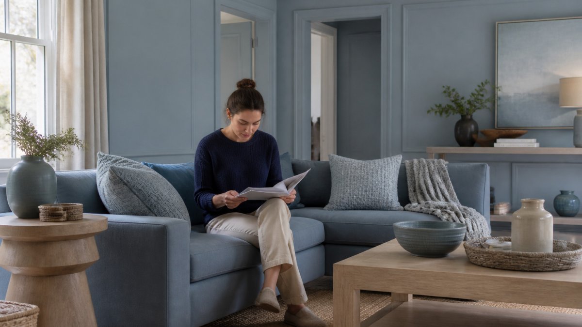
- Living room, soft blue palette: Mid-value blue-gray on the walls (60 percent), a pale blue-white tint on the ceiling and trim (30 percent), and a deep navy on the doors, built-ins, or fireplace surround (10 percent).
- Bedroom, warm clay palette: Mid-value clay on the walls, a cream tint on the ceiling and trim, and a muted terracotta or umber on the headboard wall or dresser. Keep the darkest value low in the room so it feels grounded rather than heavy.
- Kitchen, sage green palette: Mid-value sage on the walls, a soft green-white on the ceiling and upper cabinets, and a deep forest or olive tone on the island base or lower cabinets. This is a common pattern because the darker base hides scuffs near the floor.
- Bathroom, warm gray palette: Mid-value greige on the walls, a near-white tint on the ceiling and trim, and a charcoal tone on the vanity or a single accent wall. Choose a washable sheen for the mid- and dark-value surfaces.
Placement matters as much as proportion. A reliable rule is to keep the lightest value high, ceiling, upper trim, and upper wall zones, and the darkest value low or on vertical accents like doors and built-ins. That pattern mirrors how natural light falls in a room and feels balanced without effort. If you want a moodier room, invert the ratio: let the dark value take 60 percent on the walls and bring the light value in through trim, ceilings, and textiles.
For more on how sheen changes the way these layers read, see our guide on how to use paint finishes.
Monochromatic Color Scheme Examples for Real Rooms
Small rooms respond especially well to this approach. A living room in soft blue, with a lighter blue ceiling and a deeper navy door, reads as one continuous space. The eye moves smoothly instead of stopping at each color break.
Bedrooms work the same way. A clay-toned palette, with cream trim and a muted terracotta accent wall, feels warm and restful. For more ideas on small spaces, read our breakdown of 7 best interior paint colors for small living rooms.
Kitchens and bathrooms need extra attention to lighting and moisture. Choose a finish that cleans easily, and test samples under the actual fixtures you will use.
Step 4: Add Texture, Finish Variation, and Natural Materials
Paint alone can look flat, especially in a single-hue room. Texture and finish variation are what give a monochromatic scheme dimension without introducing a second color. The goal is to vary how light reflects off surfaces, not to add new hues.
Start with sheen. A common pairing is matte or eggshell on walls, satin on trim and doors, and semi-gloss on cabinets and high-touch surfaces. For straightforward guidance on sheen, durability, and choosing a finish for each room, read our paint finishes guide.
Then layer in materials that share the palette but differ in texture:
- Woven and textile elements: A jute or wool rug, linen curtains, or a cotton throw in the base hue or a tint of it. Texture in the same color family adds depth without visual noise.
- Wood and ceramic: A wood side table, a ceramic vase, or a stone tray in a deeper tone. Natural materials bring warmth that flat paint cannot.
- Glass and metal: A glass lamp base or brushed metal hardware in a lighter value. These reflect light and keep the room from feeling heavy.
- Pattern within the family: A tone-on-tone rug, a subtle stripe, or a small-scale print in tints and shades of the base hue. Keep the pattern low-contrast so it supports the scheme rather than competing with it.
Finish choice also affects maintenance, and that trade-off is worth planning for. High-traffic rooms, hallways, kitchens, kids' rooms, benefit from washable sheens like satin or semi-gloss because they wipe clean. Matte finishes hide imperfections better but scuff more easily and are harder to spot-clean. In homes with pets or young children, a common compromise is eggshell on walls and satin on trim, which balances cleanability with a soft look.
Accessibility is another practical layer. A monochromatic room with very low contrast can be hard to navigate for people with low vision. Keep at least a modest value difference between the floor and the walls, and use contrast on door casings, stair edges, and handrails so those elements read clearly.
If budget is a concern, prioritize in this order: walls first, then trim and doors, then ceilings, then built-ins and cabinets. Walls cover the most surface area and deliver the biggest visual shift per dollar. Trim and doors are next because they frame every opening. Ceilings and built-ins matter but can wait.
For specialty finishes or wallpaper that add texture beyond standard paint, see our wallpaper and specialty options.
Booking a Walkthrough to Plan Your Monochromatic Room
A monochromatic scheme rewards careful planning. Each step, from base color to finish, builds on the last. Skip one and the whole room can feel off.
If you are planning a full refresh, Always Pro Painters provides professional painting services. We build every project around the finish, not the rush, with detailed surface preparation and a final walkthrough to confirm every detail meets your expectations.
Request your Free Estimate with Always Pro Painters and start planning your monochromatic color scheme with a clear, practical plan.
Frequently Asked Questions
What is a monochromatic color scheme in interior design?
A monochromatic color scheme uses one base hue across a room and varies it through lighter tints, darker shades, and muted tones. Walls, trim, textiles, and accents all stay within the same color family, so the space feels unified rather than busy. Because the palette relies on value contrast instead of different colors, the room reads as calm and cohesive. Most homeowners start with a mid-tone base color and then add lighter and darker versions to create depth without introducing a second hue.
How many shades should you use in a monochromatic room?
Three to five variations of the base hue usually work well in a single room. One color for the walls, a lighter tint for the ceiling or trim, a deeper shade for a feature piece or built-in, and a muted tone for textiles or upholstery is a practical spread. Using too many close variations can make the room look flat, while too wide a range can break the monochrome effect. Test each sample in daylight and lamplight before committing.
How do you keep a monochromatic room from looking flat?
Add contrast in value and texture rather than in hue. Pair a matte wall finish with a satin or semi-gloss trim, and layer woven rugs, ceramics, glass, and wood accents to create dimension. Make sure the lightest and darkest values both appear in the room so the eye has places to rest. Natural elements such as a plant or a wood table also add visual interest without disrupting the palette.
Can you use different paint finishes in a monochromatic room?
Yes, and varying the finish is one of the most effective ways to add depth to a single-color room. A flat or matte finish on walls hides surface imperfections and absorbs light, while a satin or semi-gloss finish on trim and doors reflects light and defines edges. Keep the same color family across finishes so the scheme stays unified. Test finishes on a sample board, since the same color can look noticeably different under each sheen.