 how-to
Best Clean Foundation for Paint Color Consultation
Table of Contents
- Why the Best Clean Foundation for Paint for Color Consultation Starts Before the Color
- How to Prepare Walls for Painting: The Step Most Color Consults Skip
- Wall Cleaning Before Painting: Why Residue Ruins a Color Match
- Paint Color Samples on Walls: Testing Color Where It Will Actually Live
- How Lighting Affects Paint Color in Every Room of the House
- Color Theory for Paint Selection: Undertones, Neutrals, and Existing Finishes
- A Practical Color Consultation Workflow, From First Swatch to Final Walkthrough
- Frequently Asked Questions
Last Updated: October 17, 2026
Why the Best Clean Foundation for Paint for Color Consultation Starts Before the Color
The best clean foundation for paint for color consultation is not a color at all. A smooth, clean, properly primed wall shows a paint color the way it will actually look on the wall, while a patched, dusty, or uneven surface shifts that color in ways no swatch can predict.
At Always Pro Painters, a clean foundation for paint decides more consultations than any fan deck. Homeowners often blame the color when the real problem is the wall.
You cannot judge a paint color on a surface that is still fighting back. Below are the prep steps, sample tests, and lighting checks that make a color choice stick.
How to Prepare Walls for Painting: The Step Most Color Consults Skip
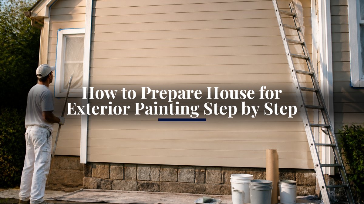
Learning how to prepare walls for painting separates a color that works from one that disappoints. Prep means patching holes, sanding rough spots, and priming bare areas before a single sample goes up, skip it and every color test is built on a false reading.
The U.S. Environmental Protection Agency's guide to lead-safe renovation matters here for older homes. Homes built before 1978 may have lead paint, so sanding and scraping need care and proper containment.
Patching, Sanding, and Priming Before You Judge a Color
Patching fills dents and nail holes so the surface reads flat. Sanding smooths patch edges until you cannot feel them. Priming seals bare drywall and patches so they absorb paint like the rest of the wall.
A common mistake is testing color over a fresh patch with no primer. The patch drinks paint differently and shows a lighter or darker spot. That spot is not the color. It is the missing primer.
- Fill holes with lightweight spackle, then let it dry fully
- Sand flush with fine grit until the surface feels even
- Wipe off dust before priming
Wall Cleaning Before Painting: Why Residue Ruins a Color Match
Wall cleaning before painting removes the film that makes new paint fail.
Wipe walls with a mild degreaser in kitchens, a gentle soap solution elsewhere, then rinse and dry completely. Pay extra attention around light switches, door frames, and any spot where hands land.
- Kitchen walls: cut grease with a degreaser, then rinse
- Bathrooms: remove soap film and check for mildew
- Living areas: dust from top to bottom, then wash
A wall can look clean and still carry a thin film that dulls the finish. Clean first, and every later step holds.
Paint Color Samples on Walls: Testing Color Where It Will Actually Live
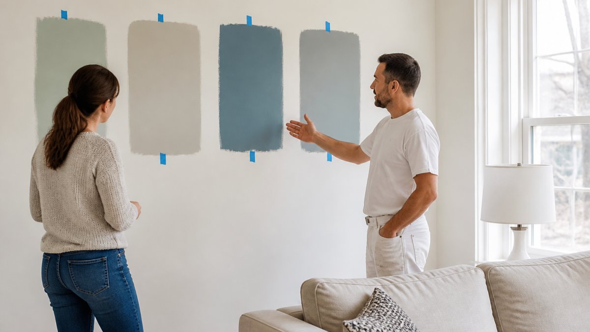
Paint color samples on walls beat paper swatches every time. A paper chip is tiny, glossy, and viewed against white; a painted sample sits on the actual wall, next to your trim, under your light.
Sample Size, Placement, and How Long to Live With a Swatch
Paint a sample at least a foot square in two spots on the same wall, one near a window, one in a corner, to show how the same color shifts across a room.
Then live with it. Check the swatch in morning light, midday, and at night with lamps on. Give it a few days, because a color that looks right at noon can turn muddy after dark.
- Size: at least one foot square, two coats
- Placement: near windows, corners, and trim
- Duration: three to five days before deciding
How Lighting Affects Paint Color in Every Room of the House
Lighting affects paint color more than most people expect. The same can of paint looks warm in a south-facing room and cool in a north-facing one, and your evening bulb can shift a neutral toward green or pink. A consultation that ignores light tests the paint, not the room.
Why the Same Color Reads Differently in Two Rooms
Paint reflects whatever light hits it. Daylight shifts from cool, blue-heavy mornings to warm, low-angle afternoons. North-facing rooms get indirect, cooler light that pulls warm colors toward gray; south-facing rooms get direct warm light that amplifies yellows and reds and washes out cool colors.
Bulb type adds a second layer. Incandescent and warm-white LEDs (around 2700K) push colors yellow-orange. Cool-white and daylight LEDs (around 4000K-5000K) push them blue. The color temperature you actually live under is the one that matters, not the one in the showroom.
A Repeatable Lighting Test You Can Run in One Day
You do not need instruments to test light, you need consistency. Run the same sample through four checks:
- Morning (7-10 a.m.): View the sample with curtains open and no lamps on. Note whether it reads warmer or cooler than expected.
- Midday (11 a.m.-2 p.m.): View it in the room's brightest natural light. This is the reading most people mistakenly treat as final.
- Late afternoon or evening (4-8 p.m.): View it with the room's everyday lamps on and overheads off, then with overheads on. Compare the two.
- Night (after dark): View it under the exact bulbs you use most in that room. This is the reading that decides whether you will be happy at 9 p.m. in January.
At each check, stand at the room's main viewing distance, the doorway, the sofa, the kitchen island, not with your nose against the wall.
Sheen, Orientation, and the Details That Skew a Reading
Higher sheen reflects more light and can make a color look lighter and more saturated than on a flat chip; matte absorbs light and reads deeper. Trim, ceilings, and adjacent walls also bounce light onto your sample, so a strong floor or bright white ceiling can tint the reading.
- Direction: South and west rooms run warm and bright; north and east rooms run cool and shadowy.
- Bulbs: Match the color temperature of the bulbs you actually use, not the ones in the store.
- Time of day: Test at the hour you use the room most, and again after dark.
Write down what you see at each check, warmer, cooler, lighter, muddier, next to the color name. That record turns a hunch into a decision you can defend.
Color Theory for Paint Selection: Undertones, Neutrals, and Existing Finishes
Color theory for paint selection comes down to undertones, contrast, and the colors already in the room. Every paint color carries a hidden warm or cool bias that decides whether two colors play nicely together: a green-undertone neutral can clash with a red-leaning floor, and a violet-undertone gray can turn pink next to warm wood.
Reading Undertones in Paint, Not Just in Makeup
Undertone is the color beneath the color, and it shows up most clearly in neutrals. A "greige" can lean green, pink, or yellow, and each version behaves differently against the same floor.
Read an undertone by comparing, not staring. Put the chip next to pure white paper, then a true gray chip, the bias reveals itself. Then place it against your floor sample, trim, and countertop.
- Warm undertones: reds, yellows, oranges; cozy and inviting, but can amplify existing warm wood and brick.
- Cool undertones: blues, greens, purples; calm and crisp, but can feel cold in a north-facing room.
- Neutrals: gray, beige, greige; check the undertone closely, because two "grays" can read entirely differently side by side.
Contrast and Color Relationships That Make a Palette Work
Color theory is about relationships, not just matching. Three do most of the work:
- Analogous: colors next to each other on the color wheel, such as blue, blue-green, and green. This reads calm and cohesive and is the safest choice for an open floor plan.
- Complementary: colors opposite each other, such as blue and orange or green and red. Used at full strength this is bold; used as an undertone against a neutral it adds life without shouting.
- Value contrast: the difference in lightness between wall, trim, and ceiling. A wall and trim in nearly the same value read soft and modern; a crisp white trim against a deeper wall reads traditional and sharpens the room's edges.
A common pattern is a fine wall color with the wrong value contrast, trim too close to the wall, room looks flat. Adjusting the trim one or two steps lighter often fixes a palette that seemed to fail.
Matching the Palette to the Room's Fixed Finishes
Start with what cannot change: flooring, countertops, cabinets, stone, brick. Pull a tone from one, then choose a wall color in the same undertone family. A warm oak floor under a cool blue-gray wall looks orange by comparison; a warm gray or greige wall lets the floor read as intended.
The American Society of Interior Designers notes that color choices work best when they account for the whole room, not just the wall. A color consultation that ignores the floor and trim is guessing.
A Practical Color Consultation Workflow, From First Swatch to Final Walkthrough
A color consultation workflow keeps the decision organized and repeatable, moving from prep to sample to lighting check to final sign-off so nothing gets skipped.
- Prep the surface. Patch, sand, clean, and prime the walls first.
- Narrow the palette. Pick three to five candidate colors based on the room and its undertones.
- Paint large samples. Apply two coats in two spots per wall.
- Test the light. View samples at morning, midday, and night.
- Live with it. Leave the samples up for several days.
- Document the choice. Record the color name, brand, and sheen for touch-ups later.
- Confirm with a walkthrough. Review the final pick in person before the full paint job.
We provide a clean foundation for paint through detailed surface preparation, guaranteeing clean lines and a solid finish without taking shortcuts.
The U.S. General Services Administration's guidance on color and finish reinforces a simple point: color decisions hold up when they are tested in context, not chosen from a chart.
Frequently Asked Questions
How should I prepare my walls before a paint color consultation?
Clean the walls first with a degreaser in kitchens and a mild soap solution elsewhere, then rinse and let them dry fully. Patch nail holes and cracks, sand the patches smooth, and spot-prime so the surface texture is even. A clean foundation matters because color reads differently over patched, glossy, or dirty spots. If you plan to test colors, paint sample boards or large swatches on the prepared wall rather than over old paint, and note which walls get direct sun so you can judge the color in real conditions.
How do lighting and existing finishes affect paint color choices?
Light changes how a color looks more than most people expect. North-facing rooms pull cool and blue, south-facing rooms warm colors up, and incandescent bulbs push everything yellow while daylight LEDs stay closer to true. Existing finishes matter too: warm oak floors, cream cabinets, and dark countertops all reflect onto the wall. Test paint color samples on walls in the actual room, view them at morning, midday, and evening, and check them against your fixed finishes before committing to a full gallon.
How do I test paint colors on a wall without wasting paint?
Buy sample pots rather than gallons, and paint swatches at least 12 inches square on the prepared wall, ideally in two spots per room. Leave a white border around each so the existing wall color does not skew your read. Look at them in daylight, at night with your lamps on, and next to your trim and flooring. Live with the samples for two or three days before deciding. Large swatches on the wall beat tiny paper chips every time because they show the color at scale and under your real lighting.
Should walls be primed before choosing a paint color?
Priming before you test is worth it when the wall has patches, stains, or a strong existing color, because those variables distort what you see. A coat of primer gives every sample the same starting surface, so the comparison is fair. If the wall is already clean, sound, and a light neutral, you can sample directly on it. Either way, let primer dry completely before painting swatches, and keep notes on which wall got which prep so your final choice holds up once the whole room is coated.
Choosing paint color feels like a color problem. It is really a prep problem. Get the surface clean, patched, and primed, and the right color becomes obvious.
At Always Pro Painters, we build every job on a clean foundation for paint, from detailed surface preparation to a final walkthrough that confirms the finish meets your expectations. No shortcuts, and no surprises after the last coat dries. Request a free estimate and let us help you land on a color you will love.